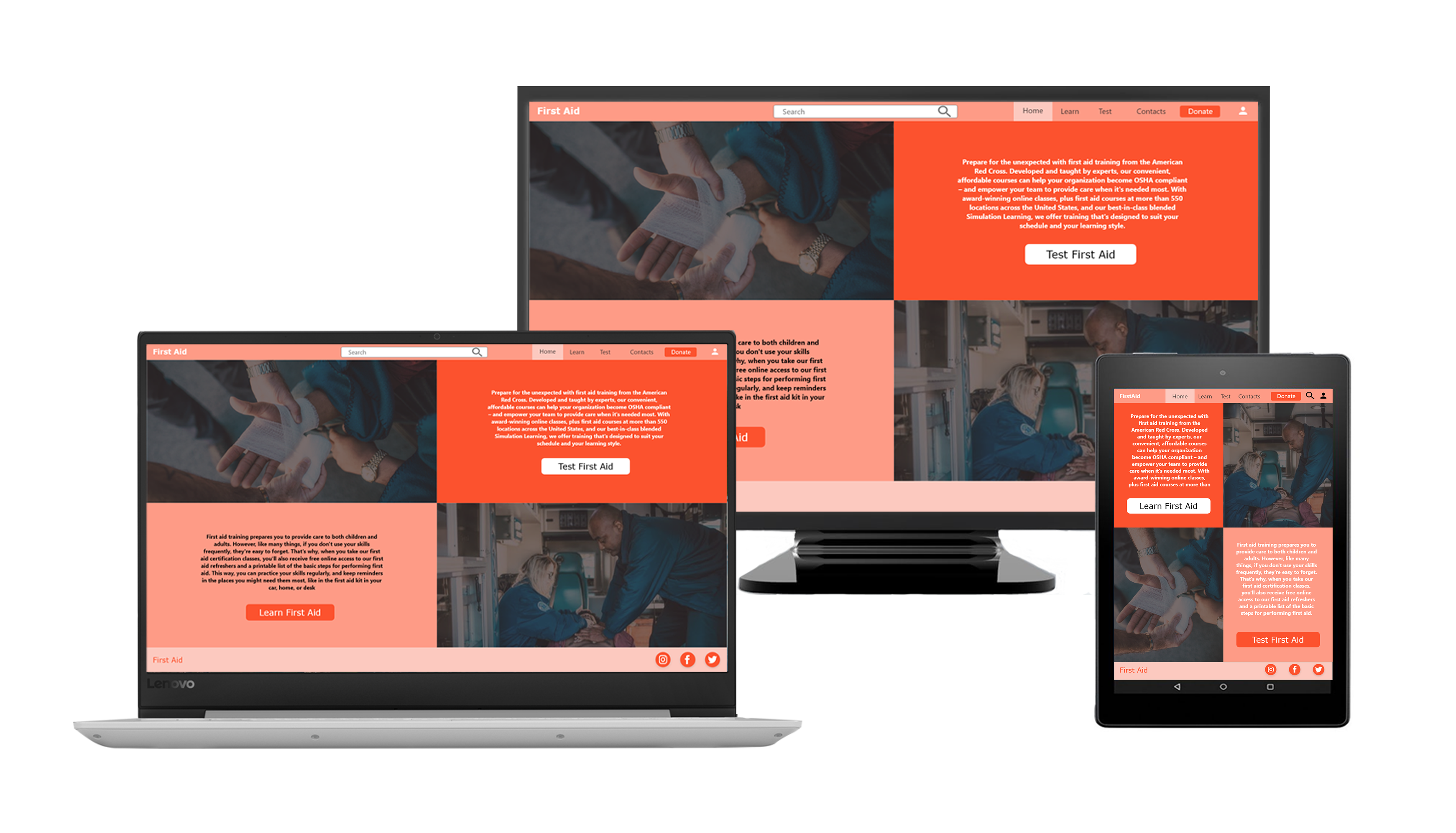
UI/UX Design
Learn First Aid and Test Your Skills App and responsive design (Google Certificate Student Project)
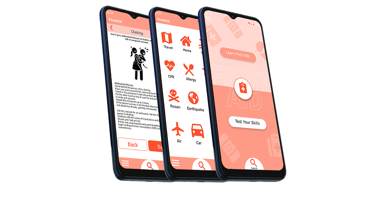
The product
Learn First Aid is easy steps learning app, web site to get First Aid knowledge for everyone. Allow to learn from any device, online and offline version, save tips and test your skills to be prepared.
The problem
To create an effective and simple way to learn First Aid for everyone.
My role
UI/UX Designer.
Responsibilities
Conducting interviews, paper and digital wireframing, low and high-fidelity prototyping, conducting usability studies, accounting for accessibility, and iteration on design.
Project goal
To design a responsive design and mobile app to help learn First Aid for any emergency situation in simple steps, test your knowledge, and become a helpful tool to save a life in any situation and place.
Target audience
Students, parents, travelers, and people of all ages who would like to learn what to do in an emergency situation and learn First Aid.
Research study details
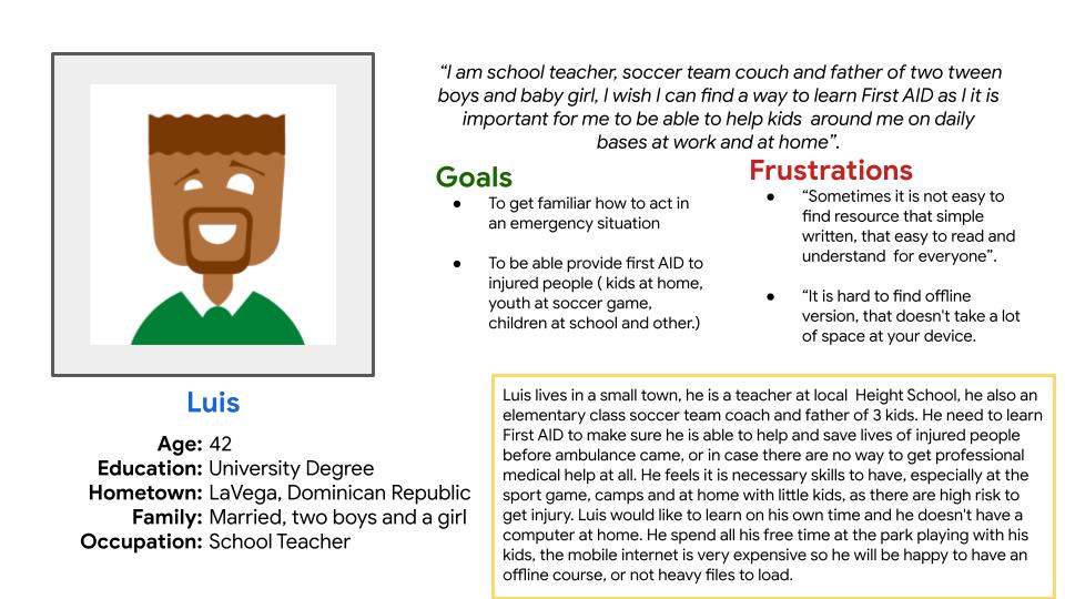
I conducted interviews and created empathy maps to understand the users I am designing for and their needs. A main user group identified through research was working full time parents, leaving in remote area who has limited time, resources to study, but need to get a skills to be able help their kids, older people, themself in an emergency situation. This user group confirmed initial assumption about First Aid users, but research also revealed that time was not only the factor limiting users from learning. Other users problems included access to internet, fluent in English and ability to use computer/phone.
Persona
Paper Sketches
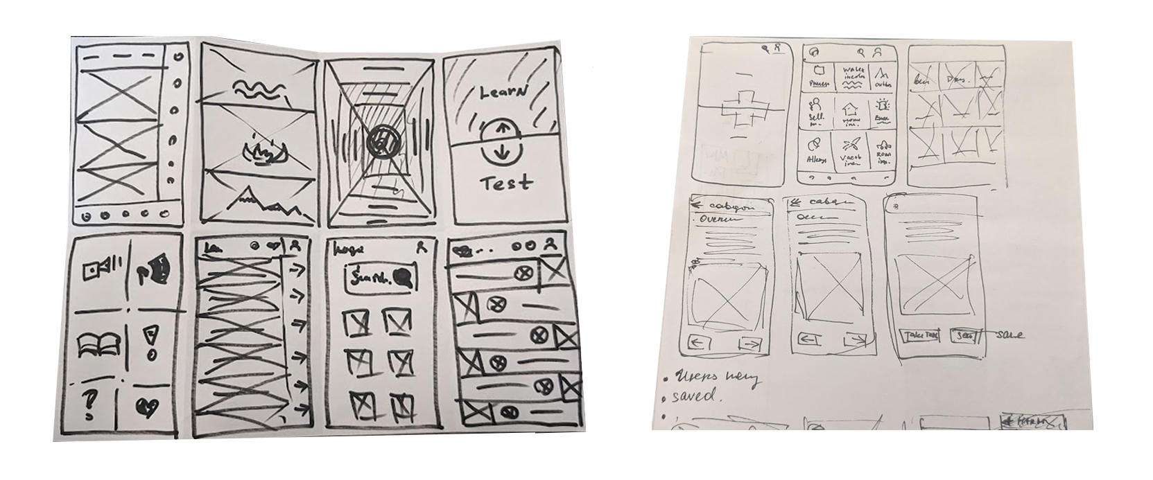
Wireframes
User testing results
- Task 1: Ask user to find First Aid category
- Task 2: Ask user to select a category page and go back to the main menu
- Task 3: Ask user to learn about first aid step by step
- Task 5: Ask user to save tips
- Task 4: Ask user to find your saved tips from the main page
Insights
Many users want to be able to find category menu to get familiar where accidents may happen to be able to see other options. Users find it is not clear when you saved the tips or course. The icon is not visible. Users find it difficult to find the step back.
KPIs:
- Time on task
- Use of navigation vs. search
- Drop-off rates
Usability Study (Before and After)
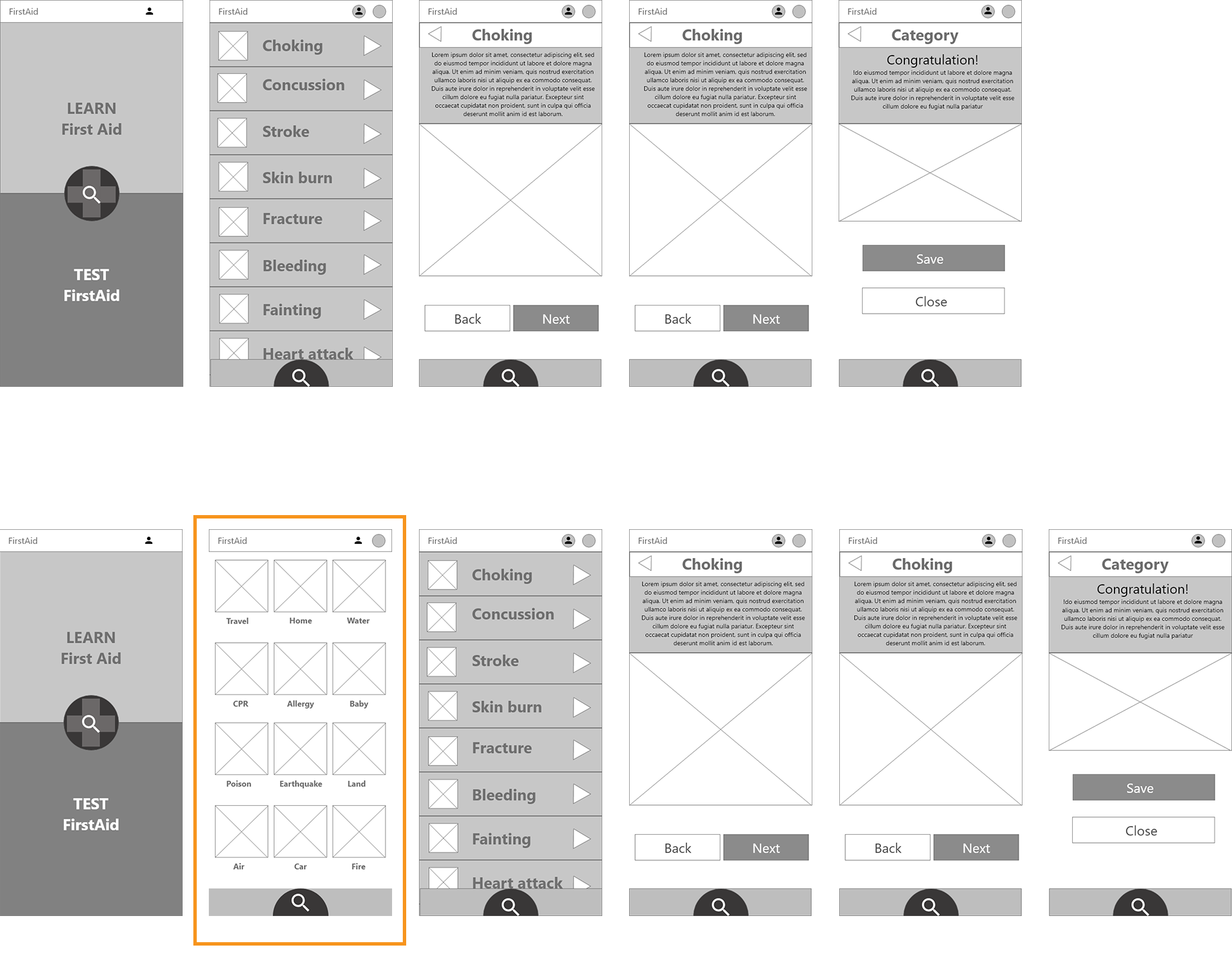
After usability studies, the icon placement, visual appearance, and screens connection have been revised. Also, an additional screen with main categories has been added.
Mockups

Responsive
